728x90
Flutter의 제스처(Gesture) 관련 위젯
Flutter에서는 사용자의 터치, 스와이프, 탭, 길게 누르기 등의 입력을 감지하는 제스처(Gesture) 위젯을 제공합니다.
이러한 위젯을 활용하면 버튼, 드래그 가능한 UI, 애니메이션 등의 다양한 상호작용을 구현할 수 있습니다.
1. GestureDetector (가장 기본적인 제스처 감지 위젯)
GestureDetector는 사용자의 다양한 터치 이벤트를 감지할 수 있는 기본 위젯입니다.
import 'package:flutter/material.dart';

void main() {
  runApp(const MyApp());
}

class MyApp extends StatelessWidget {
  const MyApp({super.key});

  @override
  Widget build(BuildContext context) {
    return MaterialApp(
      home: GestureExample(),
    );
  }
}

class GestureExample extends StatefulWidget {
  @override
  _GestureExampleState createState() => _GestureExampleState();
}

class _GestureExampleState extends State<GestureExample> {
  String _text = "탭하세요!";

  void _changeText() {
    setState(() {
      _text = "탭 감지됨!";
    });
  }

  @override
  Widget build(BuildContext context) {
    return Scaffold(
      appBar: AppBar(title: Text("GestureDetector 예제")),
      body: Center(
        child: GestureDetector(
          onTap: _changeText, // 탭 제스처 감지
          child: Container(
            padding: EdgeInsets.all(20),
            color: Colors.blueAccent,
            child: Text(
              _text,
              style: TextStyle(fontSize: 24, color: Colors.white),
            ),
          ),
        ),
      ),
    );
  }
}- onTap을 사용하여 사용자가 탭하면 텍스트가 변경됨
- GestureDetector를 감싸서 탭 제스처를 감지
2. GestureDetector의 다양한 속성
GestureDetector는 다양한 제스처를 감지할 수 있습니다.
GestureDetector(
  onTap: () => print("탭!"),            // 탭 감지
  onDoubleTap: () => print("더블 탭!"), // 더블 탭 감지
  onLongPress: () => print("길게 누름!"), // 길게 누르기 감지
  onPanUpdate: (details) => print("드래그 중: ${details.delta}"), // 드래그 감지
  onScaleUpdate: (details) => print("확대/축소 중: ${details.scale}"), // 핀치 줌 감지
  child: Container(
    color: Colors.amber,
    padding: EdgeInsets.all(20),
    child: Text("제스처 감지 테스트"),
  ),
)| 이벤트 | 설명 |
| onTap | 사용자가 화면을 한 번 탭하면 실행 |
| onDoubleTap | 사용자가 화면을 두 번 탭하면 실행 |
| onLongPress | 화면을 길게 누르면 실행 |
| onPanUpdate | 화면을 드래그하면 실행 (details.delta로 움직인 거리 확인) |
| onScaleUpdate | 두 손가락을 이용해 확대/축소하는 동작 감지 |
3. InkWell (버튼 같은 터치 효과)
InkWell은 버튼과 같은 터치 효과(Ripple Effect)를 제공하는 위젯입니다.
InkWell(
  onTap: () {
    print("InkWell 탭!");
  },
  child: Container(
    width: 100,
    height: 50,
    decoration: BoxDecoration(
      color: Colors.blue,
      borderRadius: BorderRadius.circular(10),
    ),
    child: Center(child: Text("눌러보세요!", style: TextStyle(color: Colors.white))),
  ),
)- 터치 시 잔물결 효과가 나타남
- 버튼과 비슷한 UI를 구현할 때 유용
4. Dismissible (스와이프하여 삭제)
Dismissible은 사용자가 좌우로 스와이프하여 항목을 삭제할 수 있는 위젯입니다.
import 'package:flutter/material.dart';

void main() {
  runApp(const MyApp());
}

class MyApp extends StatelessWidget {
  const MyApp({super.key});

  @override
  Widget build(BuildContext context) {
    return MaterialApp(
      home: SwipeToDeleteExample(),
    );
  }
}

class SwipeToDeleteExample extends StatefulWidget {
  @override
  _SwipeToDeleteExampleState createState() => _SwipeToDeleteExampleState();
}

class _SwipeToDeleteExampleState extends State<SwipeToDeleteExample> {
  List<String> items = ["아이템 1", "아이템 2", "아이템 3"];

  @override
  Widget build(BuildContext context) {
    return Scaffold(
      appBar: AppBar(title: Text("스와이프 삭제")),
      body: ListView.builder(
        itemCount: items.length,
        itemBuilder: (context, index) {
          return Dismissible(
            key: Key(items[index]), // 각 아이템을 고유하게 구별
            background: Container(color: Colors.red), // 스와이프 시 배경색
            onDismissed: (direction) {
              setState(() {
                items.removeAt(index); // 삭제
              });
            },
            child: ListTile(
              title: Text(items[index]),
            ),
          );
        },
      ),
    );
  }
}- 리스트 항목을 좌우로 스와이프하면 삭제됨
- Dismissible은 Todo 리스트, 이메일 앱, 쇼핑 카트 등에 유용
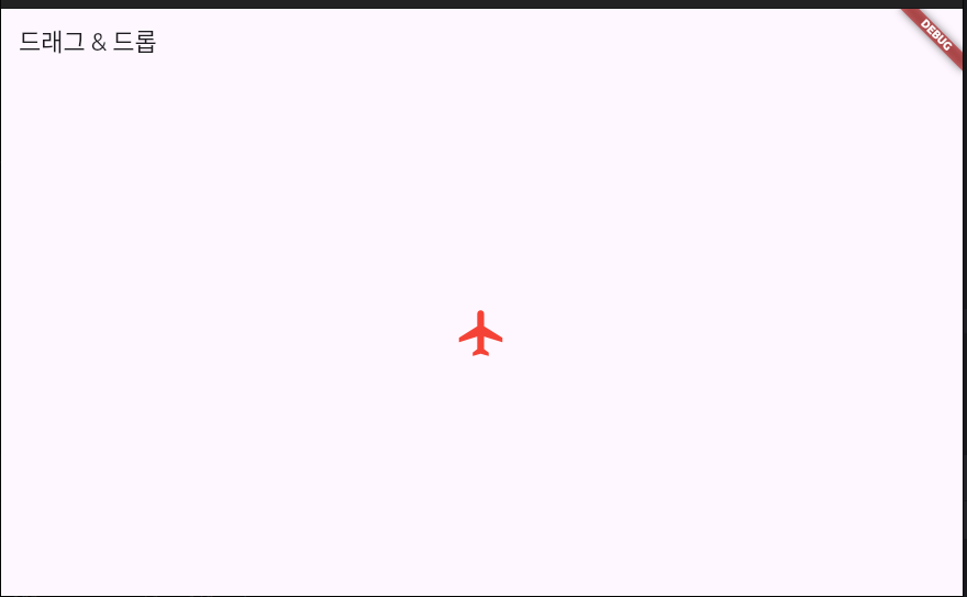
5. Draggable (드래그 & 드롭)
Draggable을 사용하면 위젯을 드래그하고 다른 위치에 놓을 수 있음.
import 'package:flutter/material.dart';

void main() {
  runApp(const MyApp());
}

class MyApp extends StatelessWidget {
  const MyApp({super.key});

  @override
  Widget build(BuildContext context) {
    return MaterialApp(
      home: DragDropExample(),
    );
  }
}

class DragDropExample extends StatelessWidget {
  @override
  Widget build(BuildContext context) {
    return Scaffold(
      appBar: AppBar(title: Text("드래그 & 드롭")),
      body: Center(
        child: Draggable(
          data: "Flutter",
          feedback: Icon(Icons.flight, size: 100, color: Colors.blue), // 드래그 시 표시될 UI
          child: Icon(Icons.flight, size: 50, color: Colors.red), // 원래 UI
          childWhenDragging: Icon(Icons.flight, size: 50, color: Colors.grey), // 드래그 중일 때 변경될 UI
        ),
      ),
    );
  }
}- 아이콘을 드래그하면 크기가 커지고 파란색으로 변경됨
- Draggable은 게임, UI 요소 이동, 맞춤형 드래그 앤 드롭 기능 구현에 활용 가능
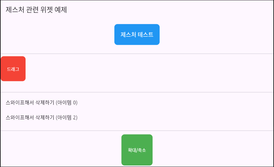
Flutter의 제스처(Gesture) 관련 위젯 예제 코드
main.dart
import 'package:flutter/material.dart';

void main() {
  runApp(MyApp());
}

class MyApp extends StatelessWidget {
  const MyApp({super.key});

  @override
  Widget build(BuildContext context) {
    return MaterialApp(
      debugShowCheckedModeBanner: false,
      home: GestureExampleScreen(),
    );
  }
}

class GestureExampleScreen extends StatefulWidget {
  const GestureExampleScreen({super.key});

  @override
  _GestureExampleScreenState createState() => _GestureExampleScreenState();
}

class _GestureExampleScreenState extends State<GestureExampleScreen> {
  String _gestureText = "제스처 테스트"; // 변경될 텍스트 상태
  double _boxX = 0; // 드래그할 박스의 X 좌표
  double _boxY = 0; // 드래그할 박스의 Y 좌표
  double _scale = 1.0; // 확대/축소 배율

  @override
  Widget build(BuildContext context) {
    return Scaffold(
      appBar: AppBar(title: Text("제스처 관련 위젯 예제")),
      body: Column(
        children: [
          // 1. GestureDetector (탭, 더블탭, 길게 누르기)
          Expanded(
            child: Center(
              child: GestureDetector(
                onTap: () {
                  setState(() {
                    _gestureText = "탭 감지!";
                  });
                },
                onDoubleTap: () {
                  setState(() {
                    _gestureText = "더블 탭 감지!";
                  });
                },
                onLongPress: () {
                  setState(() {
                    _gestureText = "길게 누름 감지!";
                  });
                },
                child: Container(
                  padding: EdgeInsets.all(20),
                  decoration: BoxDecoration(
                    color: Colors.blue,
                    borderRadius: BorderRadius.circular(10),
                  ),
                  child: Text(
                    _gestureText,
                    style: TextStyle(color: Colors.white, fontSize: 18),
                  ),
                ),
              ),
            ),
          ),

          Divider(),

          // 2. Draggable (드래그 가능한 박스)
          Expanded(
            child: Stack(
              children: [
                Positioned(
                  left: _boxX,
                  top: _boxY,
                  child: GestureDetector(
                    onPanUpdate: (details) {
                      setState(() {
                        _boxX += details.delta.dx;
                        _boxY += details.delta.dy;
                      });
                    },
                    child: Container(
                      width: 80,
                      height: 80,
                      decoration: BoxDecoration(
                        color: Colors.red,
                        borderRadius: BorderRadius.circular(10),
                      ),
                      child: Center(
                        child: Text(
                          "드래그",
                          style: TextStyle(color: Colors.white),
                        ),
                      ),
                    ),
                  ),
                ),
              ],
            ),
          ),

          Divider(),

          // 3. Dismissible (스와이프 삭제)
          Expanded(
            child: ListView.builder(
              itemCount: 3,
              itemBuilder: (context, index) {
                return Dismissible(
                  key: Key("item_$index"),
                  direction: DismissDirection.endToStart, // 오른쪽 → 왼쪽 스와이프 가능
                  background: Container(
                    color: Colors.red,
                    alignment: Alignment.centerRight,
                    padding: EdgeInsets.only(right: 20),
                    child: Icon(Icons.delete, color: Colors.white),
                  ),
                  onDismissed: (direction) {
                    ScaffoldMessenger.of(context).showSnackBar(
                      SnackBar(content: Text("아이템 $index 삭제됨")),
                    );
                  },
                  child: ListTile(
                    title: Text("스와이프해서 삭제하기 (아이템 $index)"),
                  ),
                );
              },
            ),
          ),

          Divider(),

          // 4. ScaleGestureDetector (확대/축소)
          Expanded(
            child: Center(
              child: GestureDetector(
                onScaleUpdate: (details) {
                  setState(() {
                    _scale = details.scale.clamp(0.5, 3.0); // 최소 0.5배 ~ 최대 3배 확대 가능
                  });
                },
                child: Transform.scale(
                  scale: _scale,
                  child: Container(
                    width: 100,
                    height: 100,
                    decoration: BoxDecoration(
                      color: Colors.green,
                      borderRadius: BorderRadius.circular(10),
                    ),
                    child: Center(
                      child: Text(
                        "확대/축소",
                        style: TextStyle(color: Colors.white),
                      ),
                    ),
                  ),
                ),
              ),
            ),
          ),
        ],
      ),
    );
  }
}
1. GestureDetector (탭, 더블탭, 길게 누르기 감지)
GestureDetector(
  onTap: () {
    setState(() {
      _gestureText = "탭 감지!";
    });
  },
  onDoubleTap: () {
    setState(() {
      _gestureText = "더블 탭 감지!";
    });
  },
  onLongPress: () {
    setState(() {
      _gestureText = "길게 누름 감지!";
    });
  },
  child: Container(
    padding: EdgeInsets.all(20),
    decoration: BoxDecoration(
      color: Colors.blue,
      borderRadius: BorderRadius.circular(10),
    ),
    child: Text(
      _gestureText,
      style: TextStyle(color: Colors.white, fontSize: 18),
    ),
  ),
),
사용자가 박스를 터치하면 onTap, onDoubleTap, onLongPress 이벤트에 따라 텍스트 변경
- 버튼 클릭 이벤트
- 더블 탭하여 좋아요 기능
- 길게 눌러 메뉴 표시
2. Draggable (드래그)
GestureDetector(
  onPanUpdate: (details) {
    setState(() {
      _boxX += details.delta.dx;
      _boxY += details.delta.dy;
    });
  },
  child: Container(
    width: 80,
    height: 80,
    decoration: BoxDecoration(
      color: Colors.red,
      borderRadius: BorderRadius.circular(10),
    ),
    child: Center(
      child: Text(
        "드래그",
        style: TextStyle(color: Colors.white),
      ),
    ),
  ),
),
사용자가 박스를 드래그하면 위치가 이동함
- 지도 드래그
- 카드 이동
3. Dismissible (스와이프 삭제)
Dismissible(
  key: Key("item_$index"),
  direction: DismissDirection.endToStart,
  background: Container(
    color: Colors.red,
    alignment: Alignment.centerRight,
    padding: EdgeInsets.only(right: 20),
    child: Icon(Icons.delete, color: Colors.white),
  ),
  onDismissed: (direction) {
    ScaffoldMessenger.of(context).showSnackBar(
      SnackBar(content: Text("아이템 $index 삭제됨")),
    );
  },
  child: ListTile(
    title: Text("스와이프해서 삭제하기 (아이템 $index)"),
  ),
),
리스트 아이템을 오른쪽에서 왼쪽으로 스와이프하면 삭제됨
- 이메일 삭제
- 채팅 목록 삭제
4. ScaleGestureDetector (확대/축소)
GestureDetector(
  onScaleUpdate: (details) {
    setState(() {
      _scale = details.scale.clamp(0.5, 3.0);
    });
  },
  child: Transform.scale(
    scale: _scale,
    child: Container(
      width: 100,
      height: 100,
      decoration: BoxDecoration(
        color: Colors.green,
        borderRadius: BorderRadius.circular(10),
      ),
      child: Center(
        child: Text(
          "확대/축소",
          style: TextStyle(color: Colors.white),
        ),
      ),
    ),
  ),
),
핀치 줌(손가락으로 확대/축소) 가능
- 이미지 확대
- 지도 확대
728x90
'Flutter for Beginners' 카테고리의 다른 글
| Flutter의 배치(Layout) 관련 위젯 (0) | 2025.03.14 |
|---|---|
| Flutter의 디자인 관련 위젯 (0) | 2025.03.13 |
| Flutter의 텍스트 관련 위젯 (0) | 2025.03.07 |
| 안드로이드 스튜디오에서 Flutter "Hello Flutter" 앱 만들기 (0) | 2025.03.06 |
| Flutter vs. React Native (0) | 2025.03.06 |


